6 QUICK DESIGN TIPS TO MAKE YOUR WEBSITE LOOK AMAZING IN 2024


It’s no secret that websites and online businesses are a part of the daily lives of the majority of people worldwide. But do you know how important website design is for those users? According to Forbes, the average time users spend on a webpage is about 1 minute, and if they don’t find what they are looking for in 5 seconds, they will most likely leave the page. To boot, around 57% of people won’t even recommend a business with a website that’s poorly designed.
But now, with over 2/3 of businesses having a website, you don’t need to fall for traps along the way that can dissuade people from doing business with you. Here are 6 design tips that can make your website look amazing in 2024.
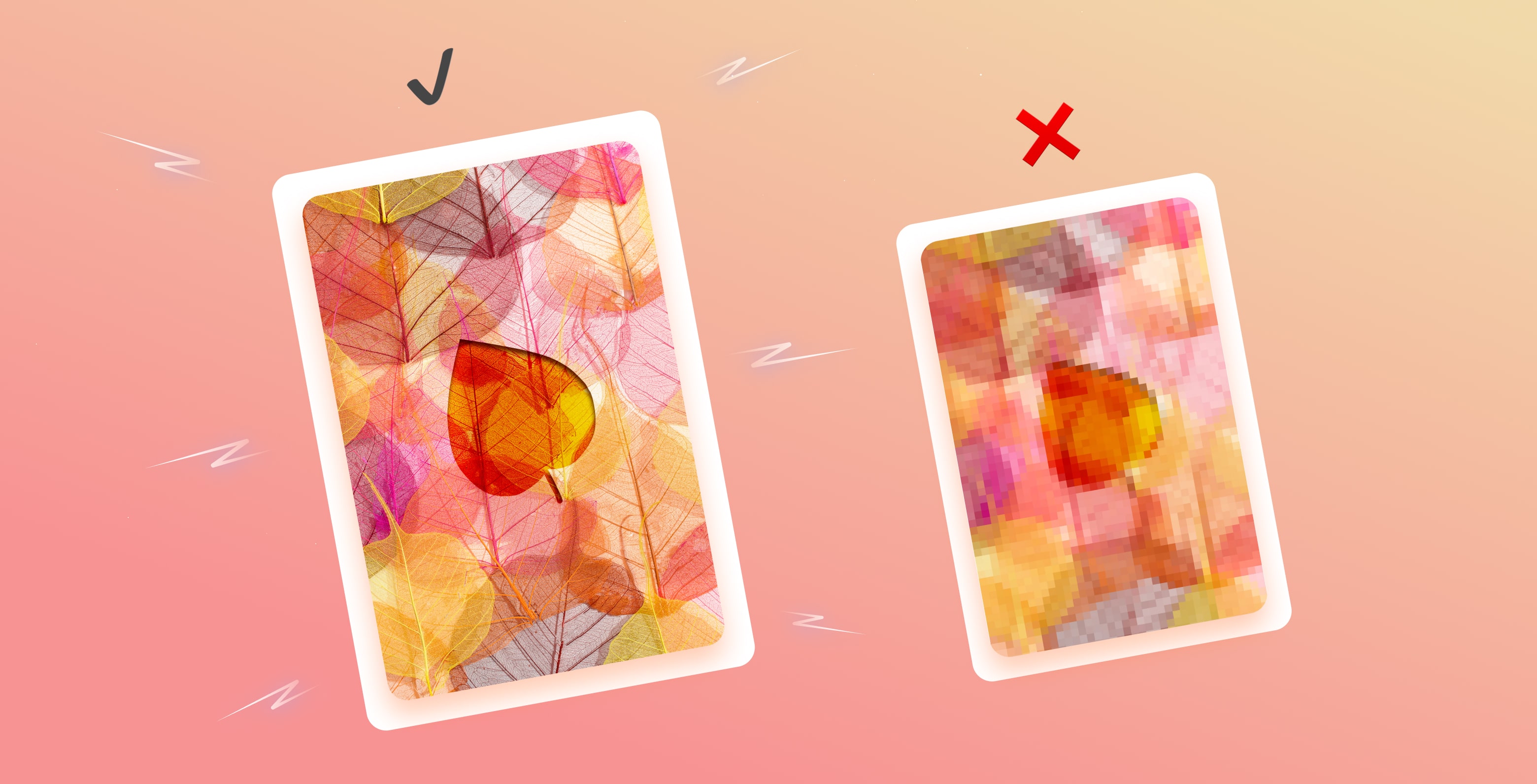
1. Using high-quality compressed images
One of the easiest ways to design a beautiful website is to use high-quality images. That means all the pictures on your website are of real people, and your designs are hand-crafted and relevant to your brand. Stock photos can be cheesy and off-putting, so try to avoid them if possible.
Getting custom graphic designs or custom illustrations will give you the best results. But if that’s impossible, opt for stock photos that allow you to edit them. You can customize the color scheme and add new text, graphics overlays, filters, and more.
While a nice-looking website is excellent, remember to optimize the images for size. Most users will bounce from your website if it doesn’t load quickly. Performance is a huge part of crafting a website in 2024, and remember to make it responsive to your audience’s multiple devices, as most search engines are mobile-first.

2. Utilize empty space
Be careful of committing one of the most common mistakes in design: overwhelming your users with too much information. Instead of cramming everything in one page, images, design, and walls of text, leave some empty space on your pages. This will help users focus on essential information and make your site visually appealing. Of course, don’t take this too far, and create more than half of your page as a blank sheet of paper.
3. Use Complementary Colors
Be careful when choosing the colors for your website—you want to ensure they complement each other well. If you're unsure which colors will work best for your site, try following the 60-30-10 rule: 60% of your site should be one dominant color, 30% a secondary color, and 10% an accent color.
Many businesses have successfully chosen one light color and one dark color that work well together. You can also use shades of the same color for a more cohesive look. Only use up to three colors on any page, as more can confuse users about how each color relates to a required action. The goal is to create an eye-catching, cohesive look that leads users through their experience while not overwhelming them.

4. Incorporate videos and animations
Another way to elevate your website design is to add videos and animations. It’s an easy way to add personality to your website while keeping users engaged. A good rule of thumb is to ensure that any videos or animations you use are relevant to your brand and add value for users—no one wants to see a pointless ad or promotional video that doesn't tell them anything about your company or product.
Once again, keep performance in mind. If your animation or videos slow users down as they navigate through your website or interrupt them from taking a crucial action, it’s best to keep things simple.
5. Use typography to your advantage
Typography is an essential aspect of web design, so choosing fonts that are easy to read and convey the right tone for your brand is vital. Stick with two or three fonts at most, and ensure they complement each other well. It’s best to keep things in the same family font and use alternate versions of the main font you chose for your brand.
Also, be mindful of how you use different font sizes—you want to ensure that your text is legible without being too small or too large. The weight of the font is also something to keep in mind when designing your website since text will be a crucial aspect of it.

6. Ensure easy navigation on all devices
So far, we talked about many aspects of the design of your website, but one of the most important ones is ensuring your website is easy to navigate on all devices. As mentioned before, people will most likely leave your website if they can’t find what they need in about 5 seconds after landing.
Here is what you need to do to create a website that has easy-to-understand navigation:
- Make sure the logo of your company leads people back to the homepage;
- Test it out on multiple devices;
- Make the menu easy to find, so users can go from page to page easily;
- Add a back-to-the-top button for longer pages;
- Ensure the composition of the page follows a logical visual hierarchy.
By making these few adjustments, and having a responsive website, you’re one step closer to leveraging mobile traffic to your advantage. Research shows that around 75% of users return to mobile-friendly websites and that over 54% of all internet traffic comes from mobile.
Your business deserves the best website design
First impressions matter, and in today’s digital world, potential customers will often judge your business based on its website design before they visit your store or speak to you on the phone. In fact, recent studies show that over ⅔ of customers judge a company based on how its website looks.
Making simple changes like those outlined above can go a long way toward creating the best website design and ensuring potential customers see your business in a positive light from the very start.
Awesomic understands the role that a great website design plays in business results. We’ve helped companies in the AI, Fintech, Healthtech, and other industries design their web applications and websites to showcase their unique voices. Schedule a demo with our dedicated team today if you’re ready to take your website design to the next level. We’re confident we can help you, too!
One subscription and your hiring problems solved


Awesomic is a revolutionary app that matches companies with vetted professionals across 30+ skill sets, from design and development to marketing and product. Based in San Francisco with a global core team, we offer a faster and more flexible alternative to traditional hiring through a subscription-based model. Awesomic delivers high-quality talent on demand, without the delays of recruiting.

We function as a subscription-based service that matches you to top-tier, vetted talent. Submit a project in just a few clicks and start receiving deliverables in as little as 24 hours. Scale your Awesomic plan up or down as your business needs change.

Every Awesomic subscription comes with unlimited revisions. You receive daily progress updates via the app, and you can provide feedback or request iterations as needed. If your project requires a different approach, you can request a talent rematch at any time, at no extra cost. You can also add teammates to collaborate and streamline feedback

A talent marketplace is a platform that utilizes data and intelligent matching algorithms to connect professionals with projects based on their skills, experience, and availability. While often used internally by large companies, Awesomic applies this model at scale, matching vetted global talent to your most critical business needs.

Hiring is time-consuming, expensive, and risky. Awesomic eliminates that problem. We rigorously vet all talent for technical ability, communication, and soft skills, ensuring only senior-level professionals work on your projects. You skip the job posts, interviews, and delays, and get straight to results.

No, Awesomic goes beyond design. While many clients utilize us for branding, UI/UX design, or motion graphics, we also provide vetted talent in no-code web development, product design, marketing, and more. Think of us as an extension of your team. A flexible, high-performing creative partner from planning to execution, whether you're building awesome products or scaling your team.

You can talk directly with your matched talent via the Awesomic app, connect via Slack, email, or schedule video calls. No matter the plan, you’ll receive daily updates in the app for every active task. You can also tag us in for any issues through our in-app customer chat.


