Digital Product Design: What is it and How to do it?

.jpeg)
Digital Product Design can be summarized as the process of creating a digital product from scratch. However, this is a broad subject, as many companies may define design and digital products differently. Simplifying the concept: a digital product can refer to any digital solution that solves users’ problems, and design can refer to the end-to-end creation and implementation of said solution.
To create a great digital product, you need a great idea and a solid digital product design process supported by talented, experienced product designers. Awesomic strives to be the #1 talent marketplace for these professionals; in doing so, we have some expertise in this field. Our talent has helped hundreds of companies complete thousands of tasks.
We decided to open a playbook and give you a straightforward step-by-step process to help ensure the success of your digital product from its inception.
Building the digital product design process in 7 phases
To build a successful digital product design process, it’s essential to understand the project’s goals and expected results. Of course, a structured process is important, but results are also a big part of any process. After all, the process exists to boost the project’s results.
We would love to say that there is a one-size-fits-all product approach, but that’s not the case, especially with the development of new tools such as AI-enabled design tools, the discovery of new insights regarding audience preferences, and even new channels to explore.
However, even though the tactical approach you take to design a digital product, or any product for that matter, may change drastically, most design processes have a few points in common, such as the general phases of digital product development.
The digital product design and development process
Developing and designing a digital product requires a standardized yet modular process. You must be able to control the quality, responsiveness, and efficiency of the output, but you also need to be able to adapt quickly to changing requirements or new challenges. Here are a couple of phases you have to nail to launch a successful digital product.
Phase 1: Ideation - Bring your vision to life
The idea is usually the first big step in creating any product. But how can you know you have an excellent idea? Ensure that your vision for the first iteration of your product is as clear as possible.
Creating a clear and concise vision for your product will minimize communication inefficiencies and help avoid misunderstandings in prioritization. A clear vision must have a couple of crucial aspects, such as who your customers are, who you are selling to, what your customers want, and which pain points your product is solving.
Here are a few questions you can ask yourself, answer, and prepare your whole team to get that same answer:
- Who are my customers?
- Who am I selling to directly?
- Does my product solve a specific problem in their personal or professional life?
- What problem does my product solve in their personal or professional life?
- How does my product ease the pain related to solving that problem?
With that answered, you can get a solid vision of your product and its planned future. Most importantly, getting people to help you develop your best product will be easier. And you’re ready to move to the next step.

Phase 2: Research - Adjust your vision to the real world
Now that you have a clear vision of your product, it’s time to understand where that product fits in the market. This is the most time-consuming and probably the most important step to get right. This is where we go deep.
Ensure you can find the most relevant information and data regarding your audience, the market, the room for scaling, and how your product will interact with other companies in the same space, competitors, or suppliers.
To get the most out of this stage, make sure that you explore data gathering as a holistic process and be open to new ways of getting the data you need. Maybe you’ll need to do interviews and field studies, succumb to focus groups, or even connect with future competitors to network and get a deeper understanding of the industry. Think of using primary, secondary, and tertiary data research, and don’t skimp on user research; after all, your digital solution is only successful if users adopt it.
Here are some questions you can ask yourself to get a clearer picture of the market you’re entering and how users perceive your digital product:
- Is there a competitor who offers solutions to the same problem I do? If so, how do they approach it, and what are their gaps?
- Is the problem I’m solving crucial to the users’ personal or professional routine?
- What is the daily routine of an ideal customer for my digital product? What challenges do they face?
- How much value do I add for my users relative to my current competitors?
- What is my ideal customer profile in tangible and intangible terms?
- How exactly does my product, in a specific time frame, help my customers by giving them more time, more efficiency, solving a need or desire, or making them more money?
By the end of your research, you should be able to answer each of these questions with data to back it up, considering users’ preferences, lifestyle, demographics, etc., as well as data on the scope for expansion in the market and competitors’ current hold in the industry.
Phase 3: Data Analysis - Data-driven empowerment
You’ve done your research, and your idea is sharp. It’s time to consider the data you gathered. We discussed how you should have some of the data available at your fingertips, but you also need to develop data assets and dive deeper into the finer details.
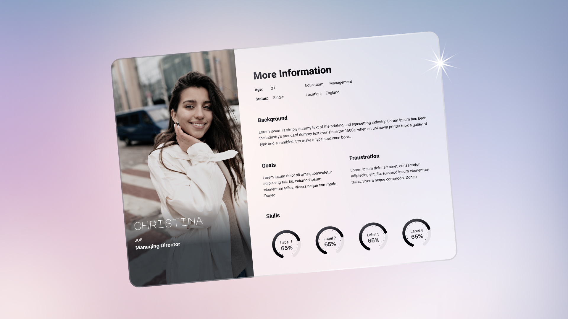
One of the best ways to see your data in action is by creating user personas and ICPs. As long as data back these assets, they’ll be invaluable. They’ll help drive design and business decisions while minimizing the overwhelming biases in decision-making when releasing a digital product.
Consider looking into the data that contradicts your assumptions; don’t let biases take over, and look at the data for what it is: no more, no less. This is so powerful that it can transform your product and how your MVP (minimum viable product) will look. This will also be the first step into creating a data-driven culture to solve users’ problems, which will help you in the long run.
Phase 4: Visualization - Map the journey
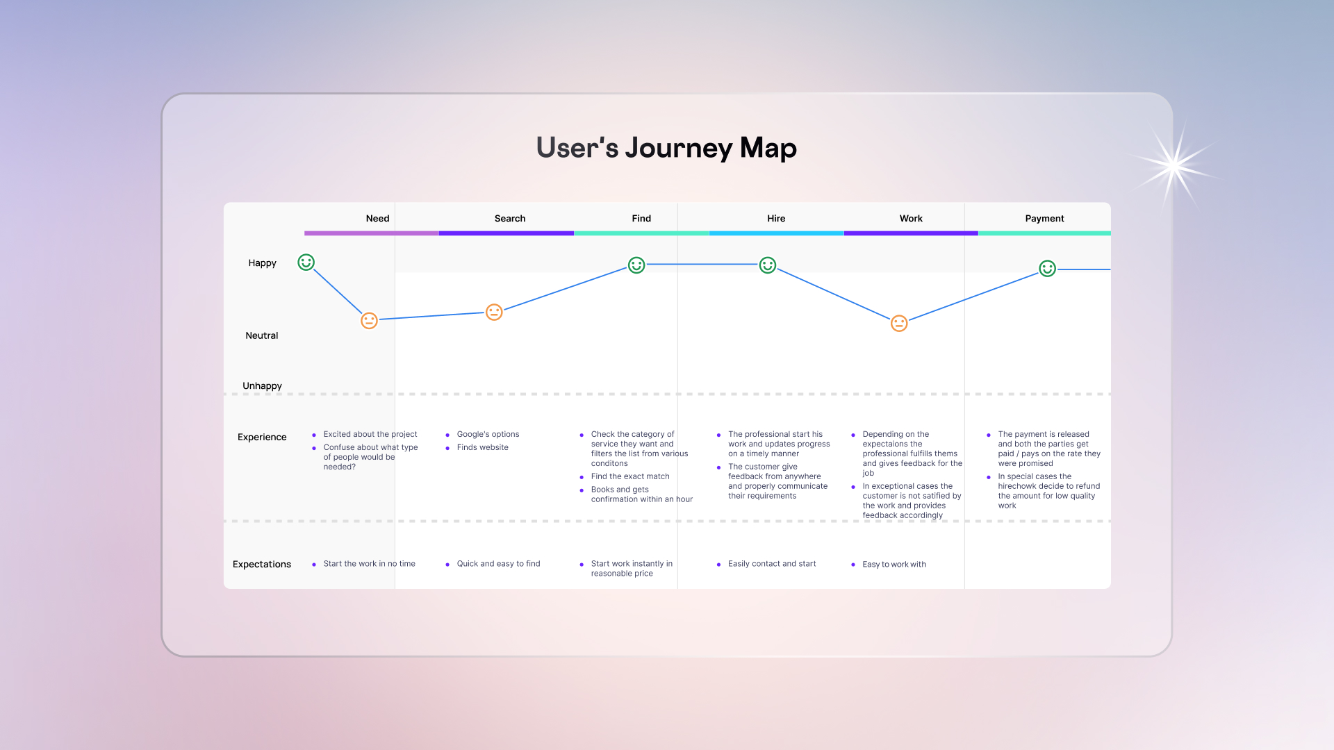
We’re close to starting the bulk of the design and development process, but first, a good phase is to map the whole user journey so you can visualize what you’ll need to develop and design.
Understand the user flow for your digital product. Describe every action your user will take and how they will interact with your product. Every interaction the user has with your product will tell you more about them and their needs.
Another popular method of visualizing how your product will fit the user’s needs is creating a user story. Whichever method you pick, the key is to visualize easily and deeply how the user will interact with your product. That’ll make it simpler to prioritize the first and most important features of your MVP.
If your digital product requires more visualization on the technical aspect, such as information architecture, this is the time to ensure you have it before moving on.
Phase 5: Design and Development - The bulk
Now that you’ve done all the research and planned all the steps, it’s time to start building your product. Here, you can start with wireframes. Wireframes are the blueprint of your project, and they don’t need to be high-fidelity. At this initial stage, settle for low-fidelity wireframes and high-fidelity prototypes.
You’ll get wireframes to discuss among the design and development team about the best path to take, and then you’ll create high-fidelity prototypes to ensure there are no gaps in the planning process. You’ll find that it’s quite rare for that to happen, so don’t skip the testing of your high-fidelity prototype. The key component here is iteration. New versions will come and go, so don’t get too attached to any.
Phase 6: Testing and validation - Make users love you
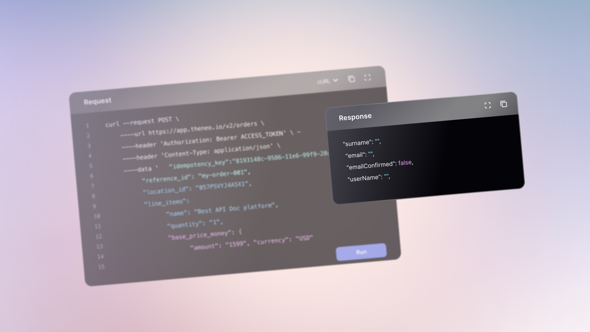
Well, now it’s time to put all your grand ideas to the test. Create a test control group for your users with limited access through usability testing and try tactics such as guerilla testing. It’s time for you to tailor the process to your audience. For instance, if you handle sensitive information, it may be best not to open too much access and instead create a paid testing team. The main idea here is to get unbiased testing for your product.
Phase 7: Iterate until Awesome - Always evolve
Digital products can’t afford to stay still. It’s as simple as that. The market evolves at a fast pace due to technological advancements in tools and systems, which can happen in just a few months or even weeks.
A dedicated team to gather data and help drive strategic decisions based on user and market insights is essential to a successful digital product design process. Test, test, test, and evolve. That is the cycle.
Ensure you know your goals, where to get to, and how you want your product to be perceived. Set up KPIs, OKRs, and general objectives that relate directly to your vision defined and evolved from phase 1. Then, test and update your product accordingly.
There are many tools for testing and conducting research. We’ll explore a few of them in a minute, but good, old A/B testing is still a great way to start if you don’t know where to begin.
Digital product design process: mistakes to avoid
This will close this section of the blog post. Here, we’ll list mistakes and pitfalls to avoid during the
To conclude this section of the article, we’ll discuss a few costly mistakes that you can avoid. These pitfalls can potentially bury your digital product, wasting time and money.
Mistake 1: Poor post-launch research
This is where many products need to catch up. Suppose you worked months on your product, launched your MVP or a new update, and people loved it for the most part. This is not a sign that you’re a genius and shouldn’t worry about being outplayed by a competitor.
After you release your product to your customer base, your customer base will start to dictate many of the directions you should follow. They will also give you hints or even direct feedback on issues that may have escaped your attention during the wireframing, prototyping, and eventual launch of your product.
The key here is to track all relevant data related to your users’ actions in the app, make it easy and frictionless to navigate and deliver feedback, and conduct user research whenever there are information gaps. Don’t skimp here; retaining your customers with an incredible user and customer experience is the key to longevity in the digital space.
Mistake 2: Picking the wrong audience
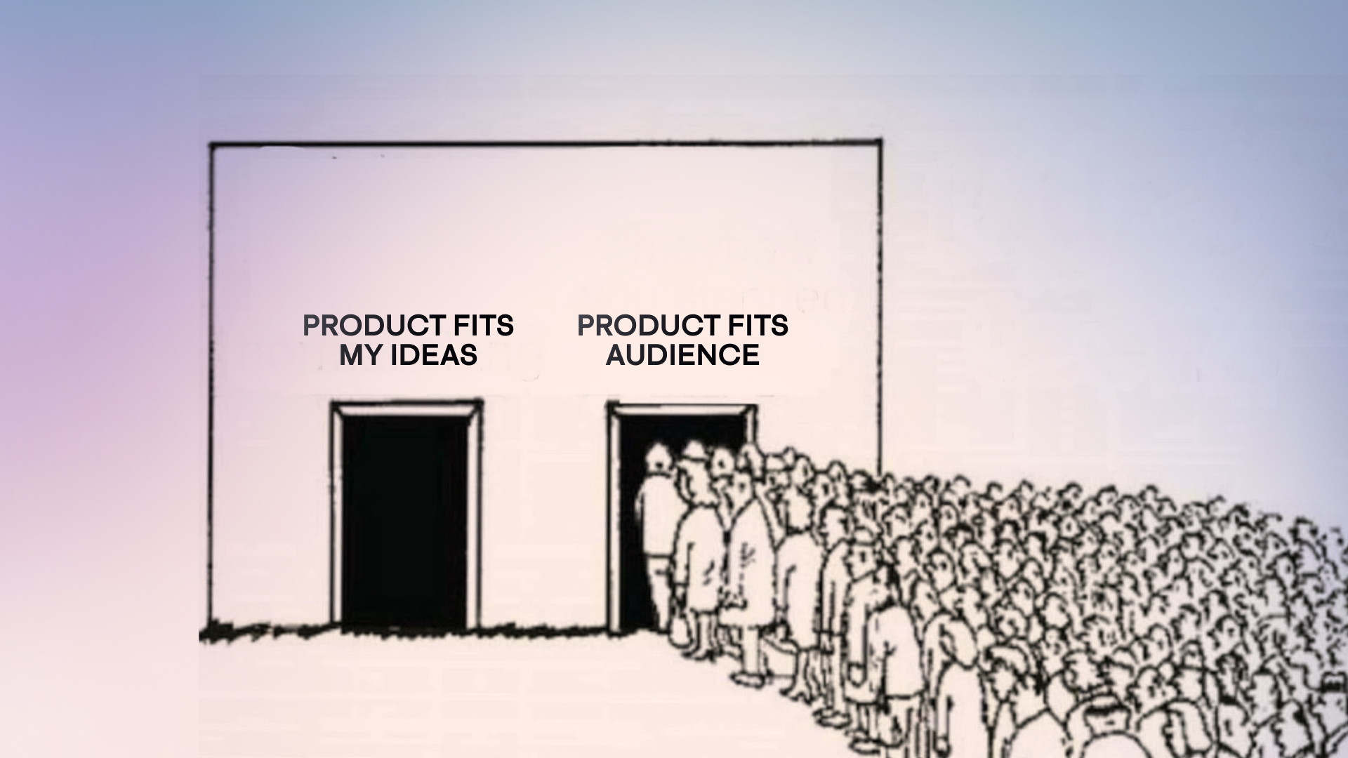
One of the gravest mistakes that may cost your business and even livelihood is picking the incorrect audience for a problem you want to solve. Without a clear picture of your audience’s pain points and how your product solves them, it becomes quite difficult to convert and retain customers.
One of the most common misconceptions is that you have to act like your competitors or even be priced like them. This can lead to disastrous results, so take a user-centric approach, listen to your users about what features they truly value, and understand how much they are willing to pay for them.
Mistake 3: Errors and breaks
It doesn’t matter how many problems your product can solve if every time the user tries to use a feature or buy the product, they can’t due to a bug or an error. This leads back to the post-release phase 7 of your design process, where users need to be able to let you know quickly about such mistakes so you can fix them.
Make sure that whenever you go through the user journey, you take in the mantle of the user and navigate through the entire user flow so breaks like these are avoidable. However, if you’re launching a multi-platform product, chances are you won’t be able to test every single spec for a user thoroughly, so make it easy for them to give you feedback and report errors and bugs.
Mistake 4: Poor product hierarchy
This is a design mistake that leads to poor user experience. You may want users to take multiple actions while navigating through your product, but if you don’t make clear which actions are more important to take at each section of your digital product, you run the risk of overloading the user with information.
Suppose you overload the user with conflicting information. In that case, you confuse the user, and confused users won’t take the actions you are expecting, most likely churning out of the product. So, even if you need multiple actions from a user, ensure the flow and hierarchy are as clear as possible.
You can use multiple design techniques to achieve this, such as positioning CTAs, elements, and text in the right places and using the size and appropriate colors to highlight the importance of taking a specific action.
Creating a digital product design strategy that brings results
Now that we have created a design process for your product, it’s time to use a strategy that can help you boost results, drive revenue, and accelerate innovation with a structured and repeatable approach.
How to design a digital product strategy
With our 7-phase design process approach, we can leverage our collected data and research into data-driven business decisions that boost product performance. Here are a couple of steps to ensure you’re using the design process to its full potential.
Unite design and business challenges for a common goal
During your development process and after launching your product, you’ll get into a myriad of small and big issues related to how your product is performing. The key here is a multidimensional collaboration between different stakeholders and their areas of expertise.
Whenever you face a challenge that directly impacts your growth, try to get a more holistic view of your team and create a collective problem for them to solve. Ensure that the design view of the issues aids in achieving the business goals. When everyone is on the same page, you can reach a point where the team runs itself.
Creating common problems for teams to solve and agreeing on the goals can reduce micromanagement and misunderstandings while removing noise from crucial decision-making.

Define metrics for success
Ensure that the metrics you’re setting help you understand how much of a goal you can achieve. Avoid the glamor of big numbers; celebrate the small victories, but don’t let yourself be led by them. Ensure that your metrics are tangible, real, and measurable with depth to explore deeper, and you’re halfway done to better understand your user and provide more value.
Evolve and adapt your strategy
Your strategy needs to be solid enough so you know where you’re going next, at least in the short term and ideally in the medium and long term. However, a digital product cannot stagnate, so make sure your strategy is modular, with different ways to reach the same goal. You need to be able to change accordingly to new technologies, new user behaviors, and even new channels to explore.
Another important aspect of your tactical plan, or strategy for implementation, is the suite of apps you will use to integrate initiatives and facilitate collaboration among your team members. We’ll explore some of those tools in a minute.
Post-launch support and delight
We currently live in a world where one person can reach many due to the democratization of the internet and social media being used population-wide. It’s a “one-to-many” communication. It’s common for companies to see the worst in this and immediately go into damage control mode. However, we challenge you to think of this differently—it’s an opportunity to delight!
Recent research shows that customers consider post-sale delight and support almost as important as the product and price. So, take advantage of this underutilized strategy to drive an elite customer experience. Think about how you can delight your customers after they decide to use your service, or even better, hire a specialist to do that for you. For example, hire an AI 3D designer through Awesomic to create immersive, memorable visuals that turn post-launch touchpoints into moments customers genuinely remember.

What digital product design tools should you use?
Here, we’ll list helpful tools for the whole process. Here’s a template:
UX research:
- Optimal Sort
- Look Back
- UserTesting
- Dovetail
- Maze
Design:
- Whimsical
- Figma
- Google Material Design
- The Noun Project
- Adobe Illustrator
- Sketch
- Adobe XD
- Canva
Communication & project management
- Notion
- Mural
- Slack
- Trello
- Asana
- Jira
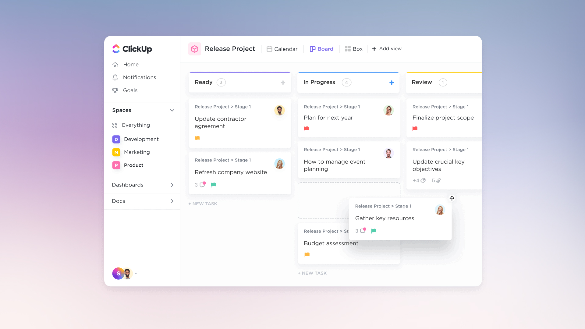
- ClickUp
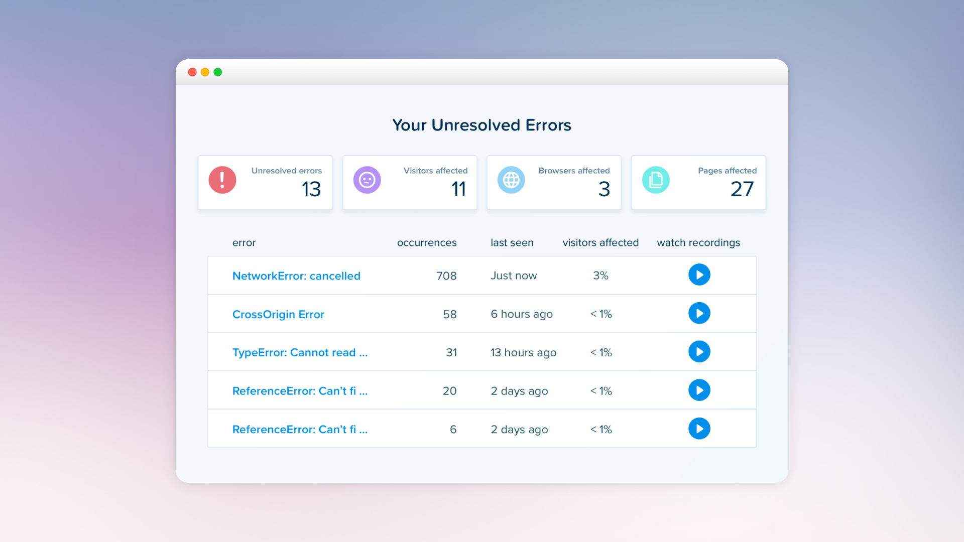
Analytics:
- HotJar
- Google Analytics
- Amplitude
- MixPanel
- Crazy egg
Development
- HotJar
- Visual Studio Code
- GitHub
- Webflow
- CodePen
- Stack Overflow
Marketing
- Zapier
- Hootsuite
- Buffer
- Mailchimp
- HubSpot
- Google Ads
- SEMrush
- Canva Pro
Trends for Digital Product Design in 2024
Finding the right timing to release a new product or feature can be the difference between being a behemoth in the streaming or a local video rental store. The same is true for digital products.
While digital products can be more easily altered, being constantly behind will incur insurmountable costs. If your architecture and strategy can’t be evolved or adapted, you’ll never get ahead. Anticipating and following trends in an adaptable way is crucial to the success of your product.
With all that in mind, here are a couple of digital product design trends.
Design trends for digital products in 2024
Creating Immersive 3D Experiences
3D was once something for top-tier computers. Nowadays, anyone with a half-decent GPU can create incredible, even photorealistic, graphics. With APUs becoming more powerful each year, 3D experiences suddenly get more power in the web and digital products.
If we’re talking about mobile, even those can run games that could only run on gaming consoles in the past. It’s good to think about transitions and parts of the experience that could use 3D animations and graphics.
Voice User Interfaces (VUIs) and voice integration
With each new year, more and more people use the spoken word to communicate with others through their smart devices and access product features. Ensure that your application has some sort of voice integration with AI or that it can be added to the product in the future.
Neumorphism and Glassmorphism
Neumorphism and Glassmorphism are ways to engage the user visually with your product through experiential design. CSS properties and additional filters can benefit both styles. The question is whether your designers have the expertise to apply these concepts.
Artificial Intelligence (AI) Integration:
AI is becoming more sophisticated, offering personalized and adaptive interactions. It’s no longer just a simple trend or possible bubble. Your designers can use AI algorithms to analyze user behavior and preferences, creating tailored experiences that enhance user satisfaction and retention. Ensuring the privacy and data security of your users is a must.
Typography as a Decorative Element:
Typography is now being used more creatively as a central design element. Designers are making what would be a simple communicative tool an integral part of the visual experience with custom fonts, altered letterforms, and unique layouts to create visually striking compositions.
Curves, 3D Rebranding, Retro and Vintage aesthetics:
There are also a couple of design trends you should consider. You don’t want to release a product that looks outdated from the moment it was created. The new trend is to smooth out edges, creating shapes that make for a friendlier aesthetic. You can combine this trend with 3D rebranding to attract younger audiences.
Retro is also a new way to bring nostalgia to older users and combine it with features that young users love. There is a nostalgic place for the 60s, 70s, and even the 90s since younger people had a childhood in the 90s. Retro color palettes, patterns, and minimalist vintage aesthetics are making a comeback. Combine these with modern design and futures to achieve a timeless yet nostalgic design.
Design your Digital Product with Awesomic
Besides being extremely rewarding, designing your digital Product can be an incredibly taxing process with high costs, slow deliverables, and overloaded talent management. Awesomic is a company that can connect you with the right cosmic talent with expertise in your industry and task.
Whether it be apps, websites, or platforms, Awesomic offers a multitude of services through our cosmic talent and carefully selected monthly plans. Check our case studies for tool expertise, results, and industry-based solutions. Unlock the true potential of your product with Awesomic, maximize results, and get an elegant, modern, beautifully crafted design to accompany it.
Awesomic has completed over 14,500 tasks, ranging from social media, presentations, no-code development, UI/UX, and product, for more than 4,000 companies in many industries, such as healthcare, finance, AI, and SasS. We’re confident we can help you, too. Book a 30-minute demo with us to find out how.
One subscription and your hiring problems solved


Awesomic is a revolutionary app that matches companies with vetted professionals across 30+ skill sets, from design and development to marketing and product. Based in San Francisco with a global core team, we offer a faster and more flexible alternative to traditional hiring through a subscription-based model. Awesomic delivers high-quality talent on demand, without the delays of recruiting.

We function as a subscription-based service that matches you to top-tier, vetted talent. Submit a project in just a few clicks and start receiving deliverables in as little as 24 hours. Scale your Awesomic plan up or down as your business needs change.

Every Awesomic subscription comes with unlimited revisions. You receive daily progress updates via the app, and you can provide feedback or request iterations as needed. If your project requires a different approach, you can request a talent rematch at any time, at no extra cost. You can also add teammates to collaborate and streamline feedback

A talent marketplace is a platform that utilizes data and intelligent matching algorithms to connect professionals with projects based on their skills, experience, and availability. While often used internally by large companies, Awesomic applies this model at scale, matching vetted global talent to your most critical business needs.

Hiring is time-consuming, expensive, and risky. Awesomic eliminates that problem. We rigorously vet all talent for technical ability, communication, and soft skills, ensuring only senior-level professionals work on your projects. You skip the job posts, interviews, and delays, and get straight to results.

No, Awesomic goes beyond design. While many clients utilize us for branding, UI/UX design, or motion graphics, we also provide vetted talent in no-code web development, product design, marketing, and more. Think of us as an extension of your team. A flexible, high-performing creative partner from planning to execution, whether you're building awesome products or scaling your team.

You can talk directly with your matched talent via the Awesomic app, connect via Slack, email, or schedule video calls. No matter the plan, you’ll receive daily updates in the app for every active task. You can also tag us in for any issues through our in-app customer chat.


