
Web App Design: Design Beautiful Interfaces with 20 Examples to Learn From

Key takeaways:
- Focus on clarity, accessibility, and speed to meet Core Web Vitals targets like LCP under 2.5s and CLS below 0.1.
- Use tools like Figma and Tailwind for design, plus frameworks like React/Next.js to build fast, responsive web apps.
- Follow a step-by-step process: research, wireframe, test with 5–7 users, then optimize for performance and accessibility before launch.
Mobile apps have become increasingly part of our everyday lives as we evolve in our digital lives. But what happens when we try to access a service through a device that is not mobile? This is where the power of well-designed web apps comes into play.
Web applications mimic the feel of a mobile app but are accessible through any web browser regardless of device. They allow for a streamlined user experience, consistent brand identity, and more customer satisfaction if done correctly. The main objective of creating a web app is to ensure users have a consistently great experience when interacting with your product. This aesthetically pleasing and intuitive experience addresses their needs.
However, achieving these objectives takes work, considering the plethora of applications available for people, the industries they are crafted for, and how users interact. So, a common solution is for web developers, designers, and product professionals to take inspiration from existing solutions and improve on them. Understanding the concepts behind the success of such designs is crucial to enhancing them and creating your unique web app that delights your users.
This article explores the underlying principles of successful web app designs, showcases the latest trends and best practices, and provides 20 practical examples. Whether you’re a web app designer, product professional, or founder, we aim to inspire you with designs that look great and deliver a great user experience.
Why Web App Design Matters
Firstly, let’s understand why web app design matters so much. The short answer is that a well-designed web app will engage users and ensure seamless use across multiple devices. It’s the path between the user and the service being offered. Imagine the moment you step outside your house, suddenly, on a random street you don’t know, and you have to rush to avoid being late for an appointment. This is the experience a poorly designed web app offers.
With the right web app design that meets your users’ needs, you can differentiate yourself from competitors, increase satisfaction, and drive conversion rates.
The Web App Design Process
A carefully planned design process is crucial to crafting a web application that goes beyond beautiful visuals. With a strategic approach, a better user experience can be guaranteed, and meeting user needs and business goals is vital to a digital product.
Considering the number of different products, services offered, and industries, there’s no one-size-fits-all approach to all designs. However, there are crucial aspects such as user interface and experience, as well as stages for product development, including web apps.
Let’s explore these stages now. The design process is a crucial aspect of web app development that sets the stage for success, which is why many teams choose to hire a web designer through Awesomic before a single line of code is written.
The grand idea
This is where the concept of the web app takes shape. It involves brainstorming sessions to generate ideas and define the app’s purpose, target audience, and unique selling points. Turning ideas into actionable items is crucial at this stage.
Designers must conceptualize how the web app will function, solve problems, and stand out in a crowded market. The app doesn’t need to go into prototyping just yet, but having a low-fidelity prototype may be helpful.
We recently published a list of 40 tools for UX and UI designers, some of which can quickly create low-fidelity prototypes with AI-powered features.
Defining your customers needs
The second stage of a web app design involves researching users, target audiences, market segments, competitors, and more. Identifying trends and analyzing them is necessary since we’re stress-testing whether the idea holds any value for the user or is better suited as a feature for another app.
Time to Design and Develop
We can start designing and developing a web app with clearly defined ideas and the essential data gathered. Whether or not your product can be created through a no-code platform or if you’ll require specialists who can code is something to keep in mind.
This process may get lengthy and murky, considering variables like cost and user fit. Awesomic offers companies the chance to connect with top-class talent worldwide who are proficient in communication and many tools to bring your life to vision.
See how Awesomic transformed the app design of a real estate startup, improving user experience and customer satisfaction. Learn more
Testing and Iteration
Testing is a continuous process that may begin alongside designing and developing certain web application features. It involves evaluating the app’s performance, usability, and functionality and gathering user and stakeholder feedback.
After acquiring the data from the testing, it’s time to create new iterations that meet the needs that arise from the tests. Making adjustments and improvements while ensuring that the final product meets the highest customer standards is crucial for companies that want longevity in today’s competitive market.
In the following sections, we’ll explore trends, best practices, and examples of modern web app interface designs in order to inspire you and your company to continue meeting user demands and even surpassing them.
Trends and Mistakes to Avoid for Web App Interface Design
UI Trends and Best Practices
Minimalism:
Borrowing the Bauhaus art movement’s adáge from the XX century: “Less is more” in modern web app design. Users appreciate clean, simple interfaces that focus on essential elements that can take them to their desired feature as fast as possible, and such apps tend to perform better.
Even applications with richer graphics and aesthetically filled designs stream design elements to make a clear breadcrumb path for users to interact with the app.
Microinteractions:
Whenever users interact with your web app, they’re sacrificing something, whether time or energy. Even if little at a time, it’s something to remember. To reward and keep the user engaged, small animations and feedback per action can provide more delightful user experiences.
Responsive Design:
As of 2024, ensuring a web app application works ideally across many different designs will no longer be a differentiation; it has become an obligation. Nowadays, users have access to more devices they didn’t in the past, such as smartwatches, VR/AR headsets, and other gadgets that were not something available to most people a few years ago. And they want to have a great experience regardless of their device preferences.
UX Trends and Best Practices
Personalization:
Personalization is a big part of the modern user experience online. From design choices to product features, users crave having more options for interacting with a product. Instead of removing or replacing features, allowing users to disable them may be more prudent, especially if your web app will have an extensive user base with different needs.
Seamless Onboarding:
There are very few things worse than accessing an application and not even knowing how to achieve the objectives that made you access the app in the first place. A smooth onboarding process can help reduce users’ drop-off rates so much that even powerful, established tools such as Photoshop offer tutorials and incorporate interactive journeys the first time a new user enters the app.
Common UI/UX Mistakes to Avoid
Ignoring Accessibility:
With the democratization of internet access worldwide, ignoring accessibility for users is a big mistake. When thinking about accessibility, we should aim to allow any user to utilize an app’s features, regardless of physical, geographical, language, or mental limitations.
Overcomplicating Navigation:
Another common mistake for rich-featured web apps is overcomplicating user navigation. As we mentioned about the trends favoring a clean design, straightforward navigation goes hand in hand. A way to still offer feature-rich products while keeping clear navigation is to allow for personalization, touching on another trend.
If you want more information on how to design digital products from the start with practices that will help you avoid these pitfalls and take advantage of trends. Check out our digital product design process guide.
Tools, Libraries, and Templates for Web App Design
When you design web app interfaces, choosing the right tools and resources makes a big difference.
I’ll share some of the best options, so you can work faster and smarter on your next project. We’ll cover everything from design and prototyping to developer frameworks and animation.
Design and prototyping
Start with design and prototyping. Figma is a top choice. It has a free starter tier and paid plans around $12 or $45 per editor monthly. It includes FigJam for brainstorming and a huge community library with popular templates like Modern Clean SaaS Company (over 51k downloads).
Sketch is a solid Mac app with a subscription model that usually costs about £9/month. Adobe XD fits well if you already use Adobe Creative Cloud, which bundles all apps for about $55/month. For interactive prototypes and hosting, Framer offers free and pro plans ranging from $15 to $20 monthly.
UI kits and components
Next, UI kits and components make your work easier. Tailwind CSS is a free, utility-first framework with Tailwind UI as a paid library from $149 up to $349. Material UI (MUI) gives open-source components plus paid pro features. Ant Design, Chakra UI, and Vuetify are excellent open-source libraries.
Don’t miss the Figma community, which offers useful kits like Modern Travel Blog or Blog App UI with high download numbers. You can even customize these kits or convert them to code-friendly formats easily.
Developer frameworks
For developer frameworks, React with Next.js stands out for SEO and server-side rendering. Vercel offers free and paid hosting plans. Vue with Nuxt and SvelteKit are great alternatives for single-page apps.
When deciding on CSS, Bootstrap is classic but heavier, while Tailwind is lighter and more flexible.
Animations
Animations make your app feel alive. Use Lottie for lightweight, vector-based animations. GSAP powers complex JavaScript animations with a free core plus paid memberships starting around $99/year. Framer Motion is a free React library loved for smooth interactions.
Handoff and collaboration tools
Handing off your work is smoother with Zeplin or Avocode, both with free trials and paid plans per user. Storybook plus Chromatic help with component testing and sharing.
In Figma, plugins like the following speed up your process and make your design more accessible:
- Unsplash
- Content Reel
- Iconify
- Stark
Brainstorming and presentations
For brainstorming and presentations, try Miro’s free tier or its paid plans ($8–$10/user/month). FigJam comes bundled with Figma and matches many paid features. Pitch or Google Slides work great for pitches.
How we help
Now, here’s how we help. Our team of designers and developers knows Figma, FigJam, Framer, Tailwind, React, and more inside out. We deliver ready-to-use Figma files with tokens, components, and variants. Need a Tailwind UI kit mapped to code? We do that too. We build apps with React/Next.js or Webflow, and even create animations using Lottie or GSAP.
We offer subscription plans starting around $200/month for AI tools, up to $1,499–$2,995/month for dedicated designers, plus quarterly discounts. You get unlimited revisions, quick match times, and no hiring hassle. When you want steady monthly capacity or fast turnarounds, count on us to boost your web app design projects with ease.
Try us and see how a subscription speeds up your work and cuts costs vs. freelance hires. You’re about to unlock modern web app design inspiration and tools that make your UX design web app projects shine.
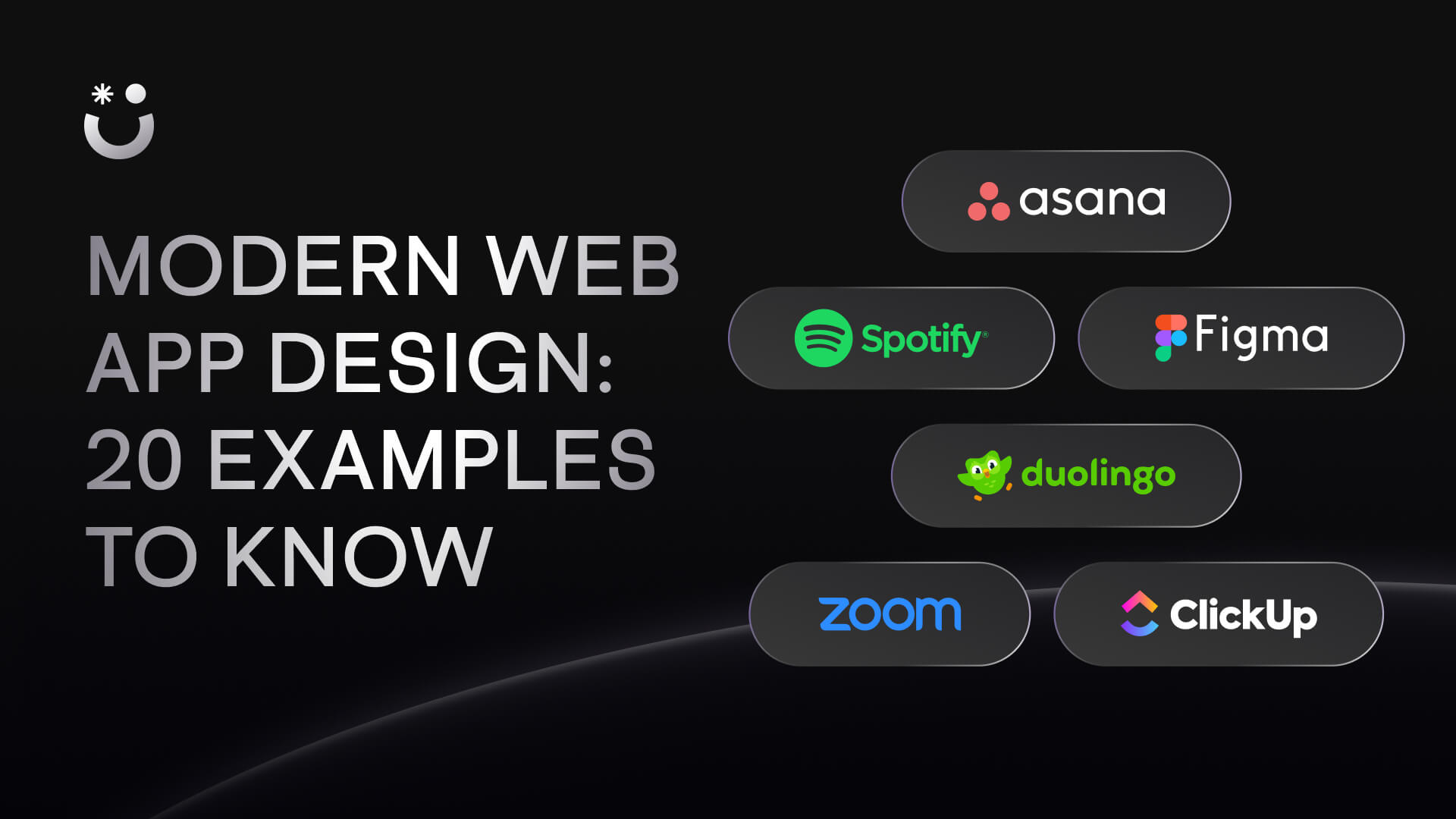
20 Web app interface designs to learn from
These 20 examples demonstrate how implementing modern trends and avoiding common mistakes can lead to exceptional web app interface designs.
1. Asana
Asana’s clean layout and intuitive navigation exemplify minimalism in design, emphasizing essential elements without overwhelming users. When you finish a task, the unicorn micro-interaction adds delight and provides instant feedback to the user, illustrating the importance of micro-interactions in modern UI design. Asana also incorporates a responsive design, ensuring a seamless experience across multiple devices.
2. Figma
Figma’s collaborative design interface and multiple tutorials align with the trend of seamless onboarding, as users can quickly adapt and start designing without a steep learning curve. The platform’s minimalistic UI approach also keeps the interface focused on the design elements, ensuring that users can find what they need effortlessly while viewing their work in real time without clutter.
3. Slack
Slack’s use of sound effects is a prime example of how micro-interactions can enhance user engagement. Not every micro-interaction needs to be visual to create a unique user experience that stands out. Slack also excels in personalization, allowing users to customize notifications and interface themes.
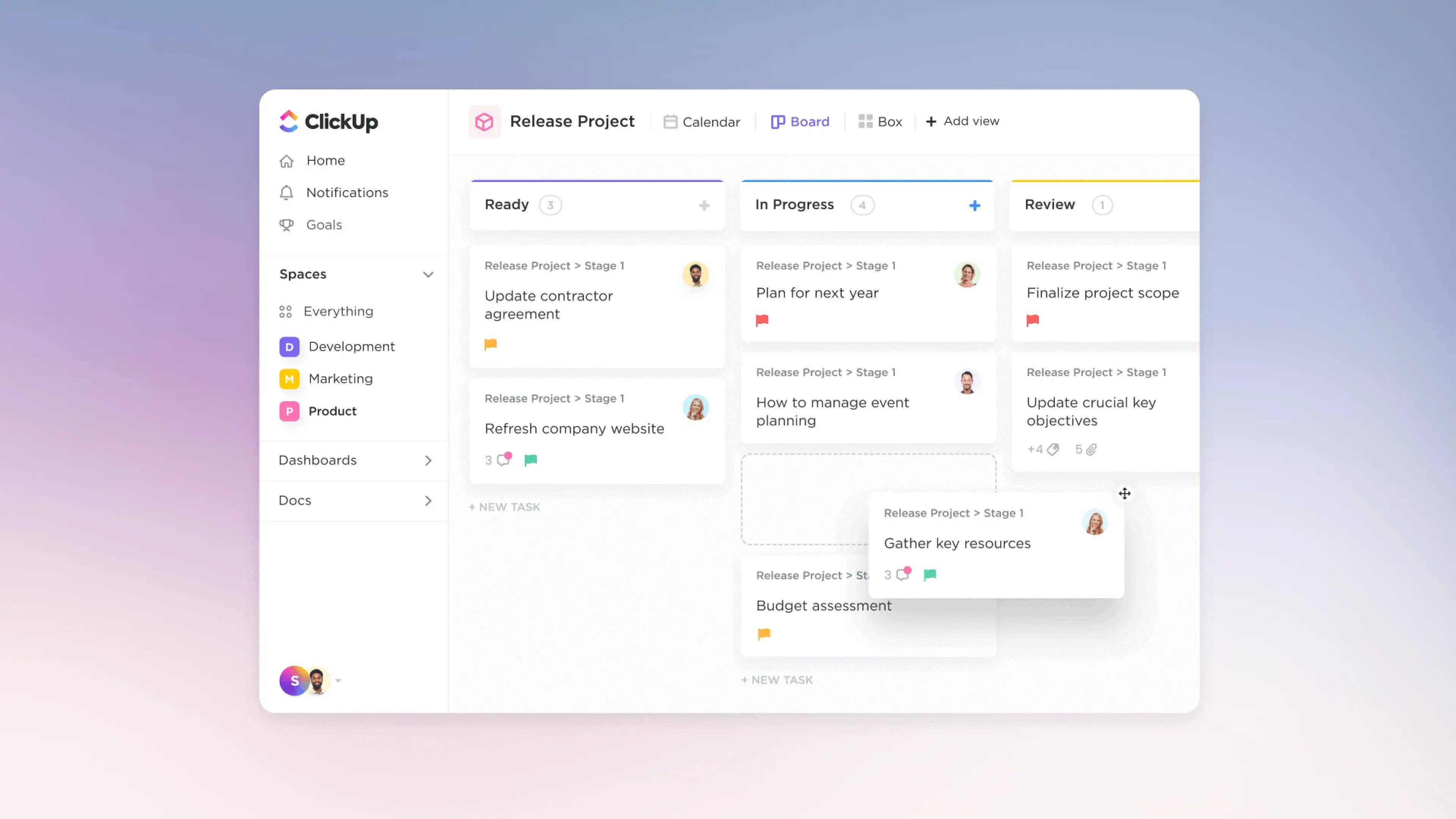
4. ClickUp
ClickUp’s colorful, all-in-one interface is an excellent example of meshing functionality and intuitive user experience. Its customizable views and flexible task management features designed to meet diverse user needs help avoid the common mistake of overcomplicating navigation. Another aspect to highlight is the responsive design, which allows for a consistent experience across multiple devices.
5. Notion
Notion’s modular interface allows users to customize their workspace to their preferences, illustrating the trend of personalization in UX design. With intuitive navigation, Notion ensures that users can easily access and organize their content, avoiding overcomplicating navigation.
6. AirTable
AirTable’s UI offers an engaging and flexible user experience through its drag-and-drop functionality, which simplifies data management, and responsive design, which allows users to work efficiently across devices. AirTable also uses conceptual minimalism to offer a user interface that doesn’t overcomplicate navigation or compromise on the rich functionalities crucial for a great user experience.
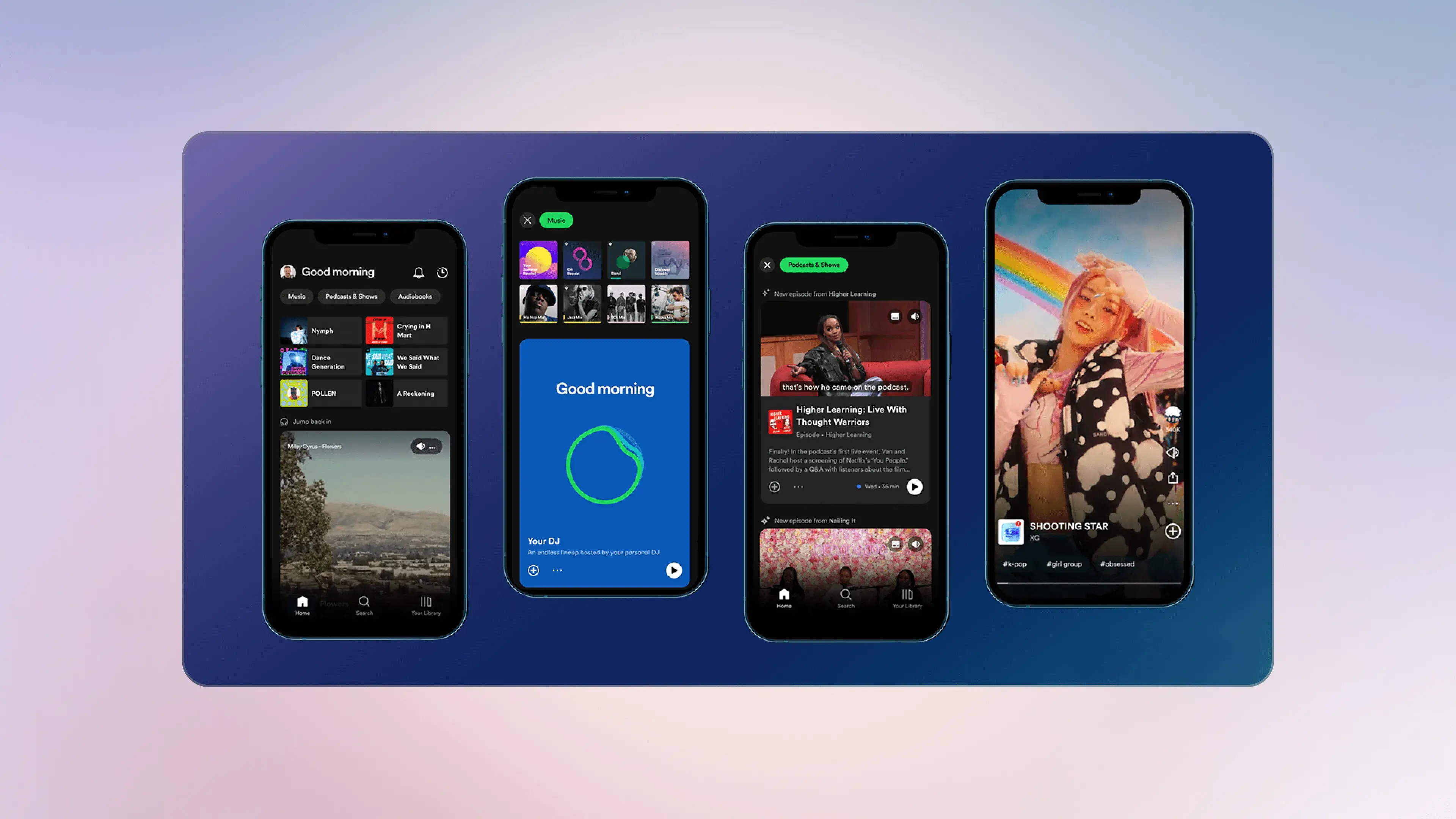
7. Spotify
Spotify’s dark-themed interface is a prime example of how minimalism can enhance the user experience by meshing in the background without diverting the users’ attention when playing music for extended periods. The platform’s onboarding process also includes curated playlists and personalized recommendations, which help users find and enjoy their favorite songs and discover new ones if they wish to do so.
8. Dropbox
Dropbox’s clean design shows how strong the minimalist trend is. The platform also emphasizes accessibility through features like screen reader support and keyboard shortcuts to ensure that all users can easily manage their files.
9. Zoom
Zoom’s minimalistic interface emphasizes functionality and practicality, allowing users to start and schedule meetings with minimal effort. Since Zoom is an app similar to a modern landline telephone, they must avoid overcomplicating the user experience.
10. Evernote
Evernote’s user interface is designed with productivity as the primary goal, incorporating responsive design and intuitive navigation to facilitate organization. The platform also has accessibility features, such as text-to-speech and adjustable font sizes, so all users can benefit from its capabilities.
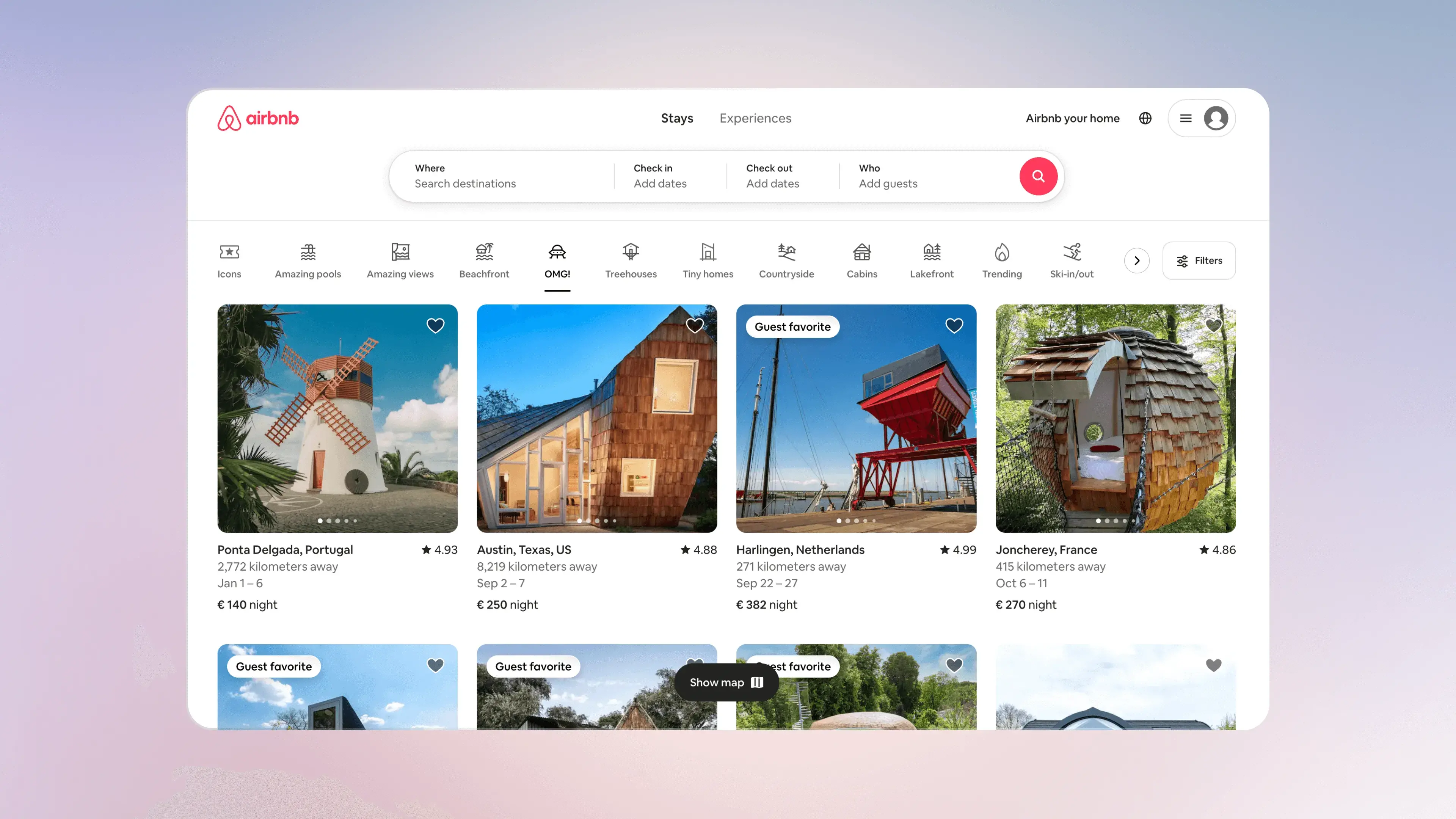
11. Airbnb
Airbnb’s rich interface utilizes high-quality images and a clean layout to create an engaging user experience. Their onboarding process and personalized recommendations demonstrate how much personalization and a smooth user journey are crucial to the business’s success.
12. GitHub
GitHub’s interface is made for developers, focusing on the essential features they need and clear navigation. This allows users to access tools quickly and supports responsive design for a consistent experience on various devices.
13. Headspace
Headspace’s calming interface is designed to enhance the user’s meditation experience. The platform takes the user by the hand on their journey for a smooth onboarding process, and personalized content recommendations demonstrate the importance of personalization.
14. Shopify
Shopify’s e-commerce interface is designed for easy use for users with all technical skills. They focus on minimalism and responsive design to simplify the tool’s setup process while offering customizable templates to ensure customers can create a unique online store that meets their needs.
15. Duolingo
Duolingo uses a gamified interface that makes language learning fun and engaging. Its focus on a quick and easy onboarding process with personalized learning paths helps users stay motivated with their progress.
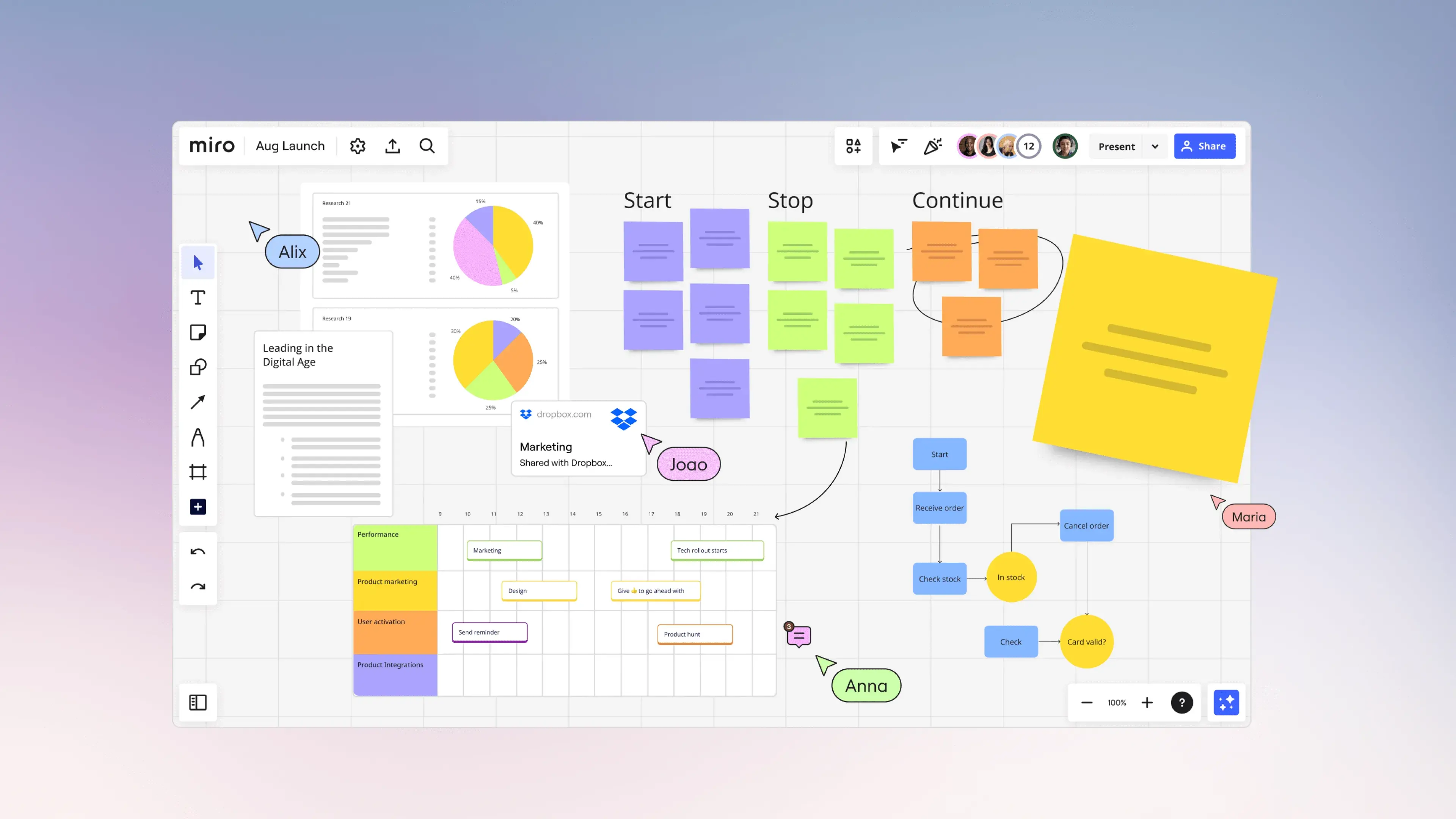
16. Miro
Miro’s collaborative whiteboard interface is designed for creativity and teamwork. Despite the app’s extensive list of tools, it still tries to embody the minimalist trend, focusing on essential tools and clear navigation.
17. Basecamp
Basecamp’s interface is for project management, focusing on minimalism and intuitive navigation. The platform’s integration of file sharing, to-do lists, and message boards demonstrates how simplicity and functionality can optimize team collaboration.
18. Microsoft Teams
Microsoft Teams’ interface unifies multiple communication tools to enhance productivity. With responsive design and accessibility features, Microsoft Teams aims to ensure all users can collaborate effectively.
19. Sketch
Sketch’s design interface is designed for UI/UX designers, offering features that facilitate their design process. Symbols and shared libraries showcase a minimalist design, enhancing productivity.
20. Mailchimp
Mailchimp’s interface combines minimalism with vibrant colors and engaging visuals. The platform embodies simple navigation, responsive design, and seamless onboarding, making it accessible to users of all skill levels. Another aspect that Mailchimp excels at is its features, showing the company understands how business outcomes directly relate to user engagement and experience.
FAQs
How do I start improving my web app design?
Begin with understanding your users and their needs. Sketch simple wireframes that focus on clear goals. Test early with real people to find confusing parts. Small changes, like better buttons or clearer text, can make a big difference.
What’s important to remember about UX design web app layouts?
Good layouts adapt to different screen sizes smoothly. Use grids and spacing to keep things neat and balanced. Make sure key actions are easy to find and use. Consistency helps users feel comfortable and confident while navigating.
How can I find great web app design inspiration?
Look at many examples, from blogs to dashboards. Notice how they organize information and guide users. Pay attention to colors, fonts, and interactions that feel easy and welcoming. Mix ideas but always keep your user’s needs first.
Why does performance matter in modern web app design?
Fast-loading apps keep users happy and reduce frustration. Slow apps lose visitors and lower conversions. Use image formats like webp or avif and techniques like lazy loading to stay quick and responsive. Performance is part of the user experience.
What makes progressive web app design different?
Progressive web apps feel like native apps but run in browsers. They work offline and load fast. They also send push notifications and update smoothly. This improves engagement while still being easy to access and share on any device.
One subscription and your hiring problems solved


FAQ
Awesomic is a revolutionary app that matches companies with vetted professionals across 30+ skill sets, from design and development to marketing and product. Based in San Francisco with a global core team, we offer a faster and more flexible alternative to traditional hiring through a subscription-based model. Awesomic delivers high-quality talent on demand, without the delays of recruiting.
We function as a subscription-based service that matches you to top-tier, vetted talent. Submit a project in just a few clicks and start receiving deliverables in as little as 24 hours. Scale your Awesomic plan up or down as your business needs change.
Every Awesomic subscription comes with unlimited revisions. You receive daily progress updates via the app, and you can provide feedback or request iterations as needed. If your project requires a different approach, you can request a talent rematch at any time, at no extra cost. You can also add teammates to collaborate and streamline feedback
A talent marketplace is a platform that utilizes data and intelligent matching algorithms to connect professionals with projects based on their skills, experience, and availability. While often used internally by large companies, Awesomic applies this model at scale, matching vetted global talent to your most critical business needs.
Hiring is time-consuming, expensive, and risky. Awesomic eliminates that problem. We rigorously vet all talent for technical ability, communication, and soft skills, ensuring only senior-level professionals work on your projects. You skip the job posts, interviews, and delays, and get straight to results.
No, Awesomic goes beyond design. While many clients utilize us for branding, UI/UX design, or motion graphics, we also provide vetted talent in no-code web development, product design, marketing, and more. Think of us as an extension of your team. A flexible, high-performing creative partner from planning to execution, whether you're building awesome products or scaling your team.
You can talk directly with your matched talent via the Awesomic app, connect via Slack, email, or schedule video calls. No matter the plan, you’ll receive daily updates in the app for every active task. You can also tag us in for any issues through our in-app customer chat.


