What Every Non-designer Ought to Know: The Principles of Design


Remember days when web design looked like text-heavy pages ripped out of a morning newspaper? Nobody would use words intuitive, usable, or enjoyable to describe their online experience. Thankfully since then, design has evolved…
Today, design is a powerful business tool that helps to create a user experience that delights and builds trust in your product or service. By the end of this article, you'll learn how to use design principles to set yourself up for a win in the big-biz games. But first, let’s start with the basics, shall we?
Understanding the Basics of Design
What is Design
To help you better understand what design is, we’ve asked our top-notch designers to define it. And this was their response...
“Design is not an art! It’s a way to solve a problem. Every design starts with a specific brief filled with tasks for designers to solve. So the visual results you get are very logical and easy to understand. Yes, there is creativity involved to make a visual picture more attractive, but the main goal is to help solve a problem” says Artem Pohrebniak, a Graphic Designer from Awesomic Community.
Importance of Design Principles
To solve users' problems designers rely on so-called design principles as guidelines in the creative process. Without these principles creating engaging and aesthetically pleasing graphics would not be possible... imagine having those distorted newspaper-looking websites back! No, thank you!
The thing is, even if you’re a business person and have nothing to do with design, I bet you would want to know how to make it your competitive advantage. If not, feel free to stop right here. The rest of you, let’s proceed.
Design Elements
Visual Elements
Visual elements are like pieces of a puzzle: get it right and your design will be both visually appealing and functional. There are five universal design elements that you need to know about—line, shape, color, grid, and space. The tools designers use to integrate these elements are called design principles.
Principles of Design
As we already established, using design principles results in a user-friendly and visually appealing user experience. They also serve to emphasize or highlight important ideas and messages. When working on design, our team suggests asking these questions:
- Is the design fulfilling its goals?
- Is it easy to perceive? (Go through the list of design principles to double-check.)
- Does the design look aesthetically pleasing?”
After identifying what your design is lacking, you can use the guide below to find the right solution.
Unity

Introducing the first design principle—unity. The primary purpose of unity is to create the right aesthetics, and harmony between your design elements. Try reading a book that has no clear storyline… Do you think the message that an author is trying to deliver will be clear? The same happens with the design that lacks unity.
Balance

Let’s move on to the next principle—balance. To simplify it, balance is responsible for a satisfying positioning and proportion of design elements.
“Usually we don’t pay attention to balance when everything is balanced well. But we do for sure when the design is unbalanced. It irritates the viewer’s eye and makes people ask questions,” shared one of our designers.
Hierarchy

Imagine landing on the website and being unable to figure out where to look. Frustrating, right? That’s when visual hierarchy comes to the rescue. Visual hierarchy helps guide users’ attention to different design elements in the order of their importance.
Examples of hierarchy would be to use bigger typeface sizes (aka font family) on the most important content, or bringing it to the top of a web page. This way your layout will have a clear visual hierarchy. Another option is to use bright colors to highlight something and muted colors to hide less important content.
Rhythm

And last but not least, rhythm. Rhythm is the repetition of visual elements to establish a pattern. Now, what do we need this pattern for? It is used to provide a stage for a special object to direct attention to the change when the pattern is purposely interrupted.
Let’s move on to another essential concept in design that you probably heard of—the color theory.
Color Theory
Color Theory was created to help designers strategically incorporate colors in their graphics. It is essential to design and cannot be adequately summarized in a single paragraph. But a good start for a beginner would be to highlight the contrast colors and number of colors in the palette.
Contrast helps elements to be visible in the background. As for the number of colors, the rule of thumb is to combine a small number of contrasting or complimentary colors. Remember: the more colors you have in your palette the harder it will be to match them. Use color schemes to assist you with that.
Color Schemes
Having multiple colors in the palette requires a special guide on how and when to use them. For that exact purpose color scheme exists. It reveals the primary colors that should dominate in your graphics, and the secondary ones used to highlight the key elements.
As we progress through our crash course in design, here are a few more things to consider…
Composition and Layout
Hierarchy and Visual Flow
One of the main design goals is to create a seamless visual flow. To achieve that, spend a good amount of time building the visual hierarchy. Feel free to experiment with scale, value, color, spacing, and placement to get your graphics right. Also, white space can help!
Whitespace
Here’s what our designers have to say about white space:
“Whitespace is one of the most tricky principles in the design. The most common questions designers get are, “Is there something missing?”, or “Shouldn’t the text be bigger?” A lack of whitespace in your layout can amplify design issues and lead to visual discomfort for the user. On the contrary, whitespace in a well-balanced design makes the layout aesthetically pleasing,” says Artem Pohrebniak, a Graphic Designer from Awesomic Community.
Elements of Composition
Lastly, your design needs composition. Composition is a space where individual elements like images, text, color, and graphics become one design. Well-thought composition will help you ensure the integrity, interconnectivity, and harmonious integration of all elements in your design.
User Experience Design
Designing for the User
Design has many shapes and forms, and one of them is user experience (UX). The goal of UX design is to create enjoyable experiences with your brand utilizing design elements and principles discussed earlier. The foundation of every UX design is the user journey, and when done right, it can turn users into brand lovers. OR haters, if done poorly. “User experience encompasses all aspects of the end-user’s interaction with the company, its services, and its products,” says cognitive scientist and user experience architect Don Norman.
Applying Design Principles
Obviously, having just a head knowledge of design principles is not going to cut it. Theory without practice has no value and will not be beneficial to your business. What’s more, doing design on your own is also not an option, especially if you’re a newbie. That’s why you need an action plan…
At Awesomic we have a track record of connecting our startup with a handpicked team of top designers to get your design projects off the ground. Our AI algorithm guarantees a successful match but also does it in under 24 hours. And to top it all off, it is all done in one app! If you need design help, contact us.
Design Projects
Our design team has done it all: design-from-scratch, partial design, complete redesign projects, you name it! Clients from different backgrounds and industries come to seek help with their designs. We match them with highly-skilled UI/UX, logo and branding, graphic, and motion designers. Check out these case studies to learn more:
Filta - NFT marketplace

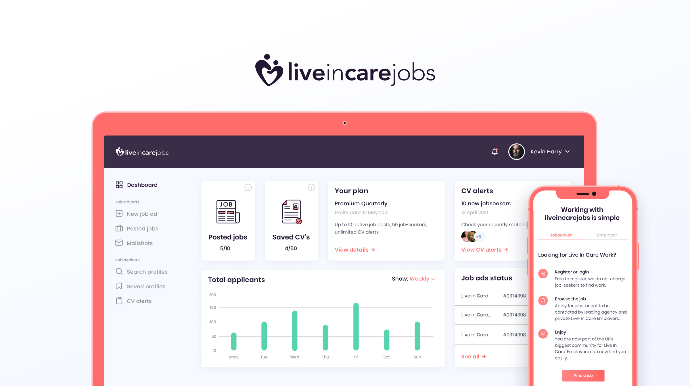
Live In Care Jobs

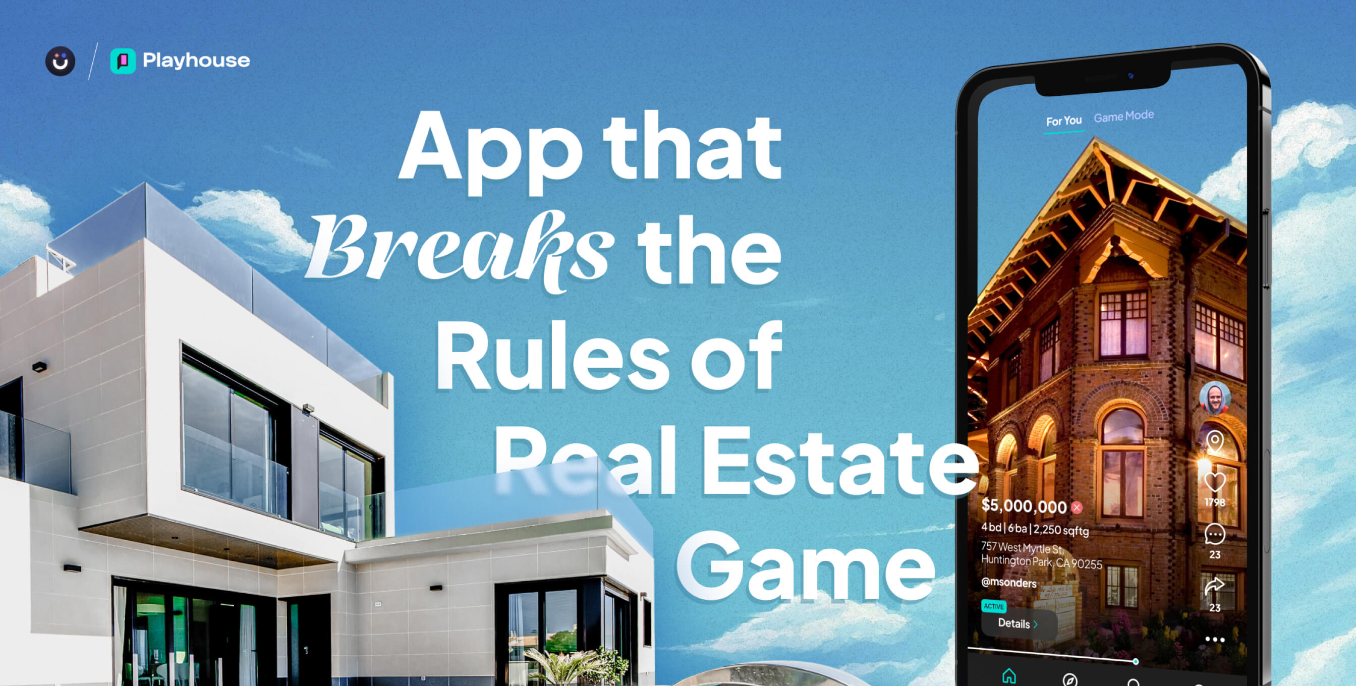
Playhouse-real estate app

Bottom line: when you master the design principles described here, you'll elevate brand loyalty and create an unforgettable experience for your users. Ready to harness the power of design for your business? Contact Awesomic today.
One subscription and your hiring problems solved


Awesomic is a revolutionary app that matches companies with vetted professionals across 30+ skill sets, from design and development to marketing and product. Based in San Francisco with a global core team, we offer a faster and more flexible alternative to traditional hiring through a subscription-based model. Awesomic delivers high-quality talent on demand, without the delays of recruiting.

We function as a subscription-based service that matches you to top-tier, vetted talent. Submit a project in just a few clicks and start receiving deliverables in as little as 24 hours. Scale your Awesomic plan up or down as your business needs change.

Every Awesomic subscription comes with unlimited revisions. You receive daily progress updates via the app, and you can provide feedback or request iterations as needed. If your project requires a different approach, you can request a talent rematch at any time, at no extra cost. You can also add teammates to collaborate and streamline feedback

A talent marketplace is a platform that utilizes data and intelligent matching algorithms to connect professionals with projects based on their skills, experience, and availability. While often used internally by large companies, Awesomic applies this model at scale, matching vetted global talent to your most critical business needs.

Hiring is time-consuming, expensive, and risky. Awesomic eliminates that problem. We rigorously vet all talent for technical ability, communication, and soft skills, ensuring only senior-level professionals work on your projects. You skip the job posts, interviews, and delays, and get straight to results.

No, Awesomic goes beyond design. While many clients utilize us for branding, UI/UX design, or motion graphics, we also provide vetted talent in no-code web development, product design, marketing, and more. Think of us as an extension of your team. A flexible, high-performing creative partner from planning to execution, whether you're building awesome products or scaling your team.

You can talk directly with your matched talent via the Awesomic app, connect via Slack, email, or schedule video calls. No matter the plan, you’ll receive daily updates in the app for every active task. You can also tag us in for any issues through our in-app customer chat.


