Clickable Awesomic logo. The C in Awesomic doubles as a smiling emoji with one of the eyes being a star.

How we created a smashing UX/UI design for the most funded app ever on Kickstarter

Awesomic crafted UX/UI design for memoryOS – the app that became the most funded ever in the history of Kickstarter (as of July 2021). Backers made an amazing pledge of $642,014 in just about a month to help bring this app to life.

Awesomic crafted UX/UI design for memoryOS – the app that became the most funded ever in the history
of Kickstarter
(as of July 2021). Backers made an amazing pledge of $642,014 in just about a month to help bring this app to life.

We also created the winning visuals for the memoryOS
Kickstarter project page, the App store, and social media.

memoryOS is a cutting-edge US startup. This ed-tech company, which is co-founded by the 2X World Memory Champion Jonas von Essen, developed a gamified app for memory improvement.

Location
the U.S.
Category
Startup
Plan
Pro
smartphone_memoryOS_case_study
2,8K
backers supported

the application

design projects

done with Awesomic

$642K

pledged on

Kickstarter
28

business days spent on

completing the project
task types:

 logo,

graphics, UI/UX,
website redesign

$642K

pledged on

Kickstarter
2,8K
backers supported

the application

backers supported

the application

28

business days spent on

completing the project

business days spent on

completing the project

Challenge

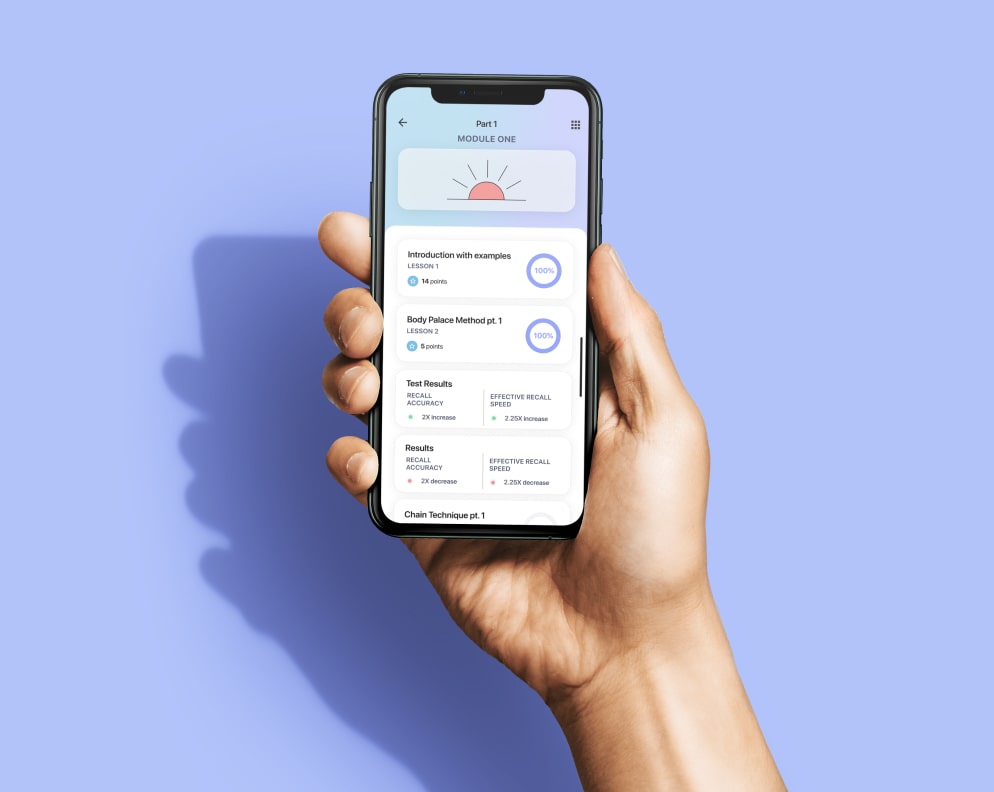
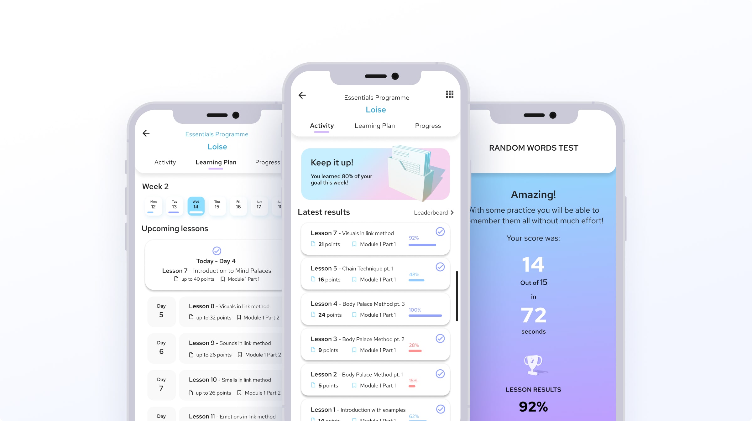
The goal was to redesign the screen drafts provided by the customer, stepping up the UX/UI game. For this, we had to improve the navigation and enhance the visuals.

The solution had to serve as an example of the Silicon Valley startup design.

Play With Before / After
Before_memoryOS_case_study
memory OS after redesigning

Improved visual hierarchy

We decluttered the UI and gave a better highlight to the crucial elements so they have a distinctive and more playful look.

Typefaces that rock

We replaced the main typefaces with ones that are more user-friendly. Instead of the original Red Hat Text we chose SF Pro Display that is more common for iOS apps.

font_memoryOS_case_study

Enhanced structure

The initial screens had a surplus of fonts, sizes, and colors. We simplified, unified, and structured the visual elements.

Engaging visuals
for Kickstarter

Attractive, convincing, trust-building. We created visuals for Kickstarter that helped memoryOS to raise an astonishing pledge from backers.

Attractive, convincing, trust-building.
We created visuals for Kickstarter
that helped memoryOS to raise an astonishing pledge from backers.

Visuals for the App store

We also designed clean and attractive visuals
for the memoryOS page in the App store.

We also designed clean
and attractive visuals for the
memoryOS page in the App store.

We also designed clean and attractive visuals for the memoryOS page in the App store.

Result

With the design assistance of Awesomic, memoryOS became the most funded app ever on Kickstarter. Our visuals for different platforms won the trust of more than 35,000 early adopters of the app.

We enjoyed much our work with the amazing, inspiring, and perseverent memoryOS team. The collaboration between memoryOS and Awesomic is going to continue.

"It has been a fantastic experience so far, and we are grateful and proud to obtain
the golden Trophy of The Most Funded
App Ever. We will remember everyone
who has helped to make this happen.
Thank you!"
"It has been a fantastic experience so far, and we are grateful and proud to obtain the golden Trophy of The Most Funded App Ever. We will remember everyone who has helped to make this happen. Thank you!"
Alex_Ruzh_memoryOS_case_studyAlex_Ruzh_memoryOS_case_study
Alex Ruzh
CEO & Co-founder at memoryOS

WitH Awesomic, you let us know the destination — we match you with the crew