Design digest #23: Uber redesign, using AI to Break Down Barriers in UX Design & iOS Navigation Patterns

This digest was collected by Oleh Idolov, Mirona Zulgarina, Alisa Hrynkevich, Anastasiia Demchenko, and Zakhar Kryvoshyya at Awesomic. Discuss the digest in the comments, and sign up for the updates!
🦄 Product and UI/UX Design
Articles and case studies
🔗 Spotify’s new design turns your music and podcasts into a TikTok feed | The Verge
🔗 Design notes on the 2023 Wikipedia redesign | Alex Hollender
🔗 The Psychology Behind Loom's Explosive Growth | growth.design
🔗 3 lessons from Bumble’s onboarding | UX Collective
🔗 Designing Zenly: Part I. 2015–2017 | Julien Martin
🔗 The Anatomy of a Good Design: An Analysis of 4 Sites | NN/group
🔗 Visual design, vibes and lack of taste | Stan Govorukhin, Djinni
🔗 Sparkles aren’t good UX✨| UX Collective
🔗 Modern iOS Navigation Patterns | Frank Rausch
🔗 Using AI to Break Down Barriers in UX Design | UX Mag
🔗 The state of SaaS marketplace UX | UX Collective
🔗 4 Design Patterns That Violate “Back” Button UX Expectations – 59% of Sites Get It Wrong | Baymard
Institute
🔗 The playful design details of the Playdate console | Clip Content
Projects
👁 The re-designed Uber App | Charlie Waite, Uber

👁 Lacoste Heritage | BONHOMME

United States Space Force | Wildlife, GSD&M, plan8

👁 LVMH Prize | B-Reel

yonder | Significa, Teresa Vilararaujo

Quai Network | Unseen Studio

Our Revolution | Likely Story, JamesPowell.dev, Andrea Jelic

The Singularity | Squarespace

Critical Danger | Somefolk

Mike Matas is an American user interface designer and icon artist. He has previously worked at The Omni Group doing interface and graphic design work. Matas co-founded Delicious Monster. In 2005 he went to work for Apple, where he designed user interfaces and artwork for the iPhone, the iPad and Mac OS X.


👀 Visual Communication
Articles and case studies
🔗 New Yorkers Threw a Tantrum Over the New “We❤️NYC” Logo – Are Their Feelings Valid? | Print Mag
🔗 Pepsi's new logo: what designers like and don't like | Ad Age Creativity
🔗 Pink Floyd and Pentagram celebrate 50 years of Dark Side of The Moon | Creative Boom
🔗 The AI boom is creating a new logo trend: the swirling hexagon | Fast Company
🔗 “The people are more important than the work.” Alright Studio’s recipe for happiness and success | The Brand Identity
🔗 'I wanted to be part of the change': Jessica Walsh on her journey to founding &Walsh | Creative Boom
🔗 Margaret Flatley on creating narrative stories, how to draw dynamic compositions, and why she's lured to the fantastical | Creative Boom
🔗 How the visual identity for Offf Festival came to life | Creative Review
🔗 Ukraine issues postage stamp featuring "prophetic" Banksy artwork | deezen
Projects
OpenAI | AREA 17

👁 New York City unveils controversial revamp of "I ♥ NY" logo | Deezen

👁 Pepsi’s new logo takes influence from its 90s predecessor | Design Week

👁Netflix is a Joke: The Festival is a deliberate laughingstock | PORTO ROCHA

👁 Ceramicah | Present Studio

👁 Stolp | FCKLCK

👁 Nordoff and Robbins | Pentagram

👁 Cohere | Pentagram

👁 apron | Opening Line / Outsiders

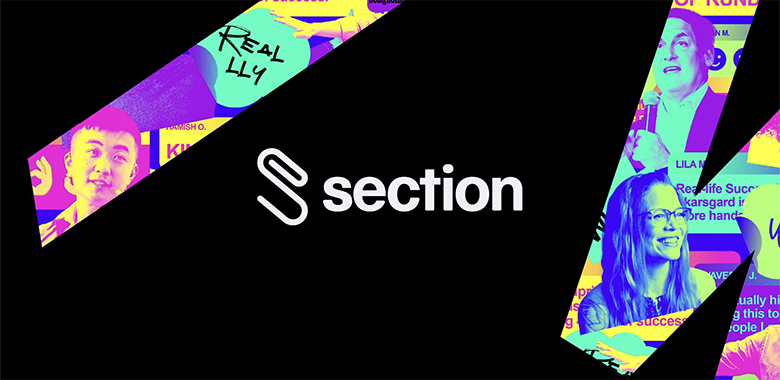
👁 Section | Design Studio
👁 Pack of the Month: Unlearn Studio Delivers a Cannabis-Infused Kombucha With High Tide | Dieline

👁 Brite | MultiAdaptor

👁 Збройні Сили України – Armed Forces of Ukraine | Taras Ishchyk, Orest Pidlisetsky, Dmytro Rastvortsev, Marchela Mozhyna

👩🚀 Career Growth, Design Management and Leadership
A Comprehensive Checklist For Running Design Workshops | Slava Shestopalov, Smashing Magazine
How the Figma design team level set on career leveling | Figma
UX Strategy: Study Guide | NN/group
Discomforts of Great Design Management | Alexander Vilinskyy
Yes, you should embed UX researchers into your design teams. Here’s why… | Designing Atlassian
Lean UX & Agile Glossary | NN/group
🔠 Typography
AI generated fonts get roasted on Twitter | Creative Bloq
Sharp Grotesk Goes Global – Pan Euro released Sharp Grotesk Pan Euro‚ Sharp Grotesk Hangul‚ and Sharp Grotesk Thai
LTR NCND | textured typewriter face by LettError
Regrets | art nouveau display typeface by OH no Type Company
Netto | geometric rounded typeface and icon set by TypeMates
🚀 Products and Tools
Figma
Little Big Updates: multi-select search, on-canvas preview, luminance mask support, leading trim, hanging punctuation, sticky scrolling in prototypes, and many more.
Adobe
AI Art Generator – Adobe Firefly
What’s new in Photoshop and Illustrator: More Share for Review capabilities | Adobe
AI tools
Midjourney Version 5 for Web Design - The Results
Midjourney V5 is here ! So, what’s new? | Bootcamp
Spline AI – 3D Design faster with AI
GPT-4 | OpenAI
Noya – Draw wireframes, get designs & code
Google announces AI features in Gmail, Docs, and more to rival Microsoft | The Verge
Introducing Microsoft 365 Copilot – your copilot for work | Microsoft
Genius – AI design companion | Diagram
How to design generative AI experiences to be truly helpful | UX Collective
FigGPT Figma Plugin | Alex Shevenionov
Introducing AI-Generated Product Descriptions Powered by Shopify Magic | Shopify
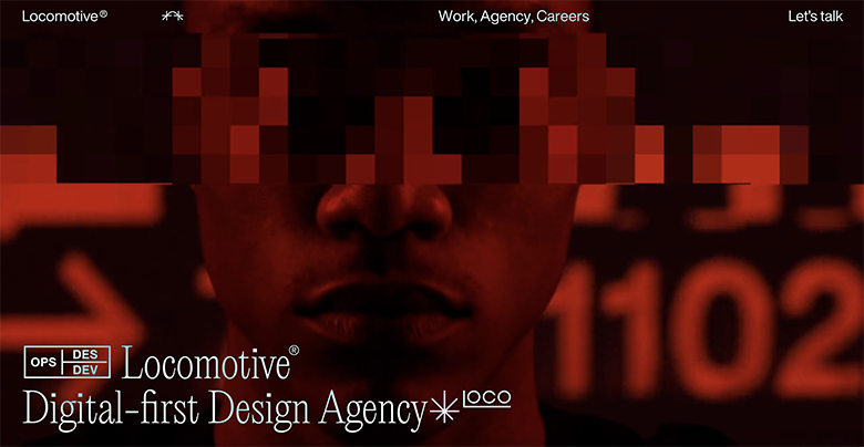
ChatGPT Lifts Business Professionals’ Productivity and Improves Work Quality | NN/group
🤔 Other
Read
‘Make Something Wonderful’ is the first publication from the Steve Jobs Archive | Wallpaper
Watch
How to Build An MVP | Startup School | Y Combinator Blog
Listen
What Is CX Design? | Debbie Levitt, Smashing Podcast

🤪 Memes

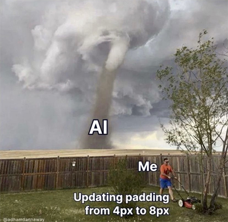

Awesomic is an open-minded team of people who are changing the way of getting design done. It’s the right place for professional design growth and a great spot for motivated individuals. And for humor, of course!
Join if you feel the same. We have open positions for UI/UX Designer, Senior UI/UX Designer, and many others.
Want to stay updated on what’s going on in the design community? Sign up for our email subscription 😉
One subscription and your hiring problems solved


Awesomic is a revolutionary app that matches companies with vetted professionals across 30+ skill sets, from design and development to marketing and product. Based in San Francisco with a global core team, we offer a faster and more flexible alternative to traditional hiring through a subscription-based model. Awesomic delivers high-quality talent on demand, without the delays of recruiting.

We function as a subscription-based service that matches you to top-tier, vetted talent. Submit a project in just a few clicks and start receiving deliverables in as little as 24 hours. Scale your Awesomic plan up or down as your business needs change.

Every Awesomic subscription comes with unlimited revisions. You receive daily progress updates via the app, and you can provide feedback or request iterations as needed. If your project requires a different approach, you can request a talent rematch at any time, at no extra cost. You can also add teammates to collaborate and streamline feedback

A talent marketplace is a platform that utilizes data and intelligent matching algorithms to connect professionals with projects based on their skills, experience, and availability. While often used internally by large companies, Awesomic applies this model at scale, matching vetted global talent to your most critical business needs.

Hiring is time-consuming, expensive, and risky. Awesomic eliminates that problem. We rigorously vet all talent for technical ability, communication, and soft skills, ensuring only senior-level professionals work on your projects. You skip the job posts, interviews, and delays, and get straight to results.

No, Awesomic goes beyond design. While many clients utilize us for branding, UI/UX design, or motion graphics, we also provide vetted talent in no-code web development, product design, marketing, and more. Think of us as an extension of your team. A flexible, high-performing creative partner from planning to execution, whether you're building awesome products or scaling your team.

You can talk directly with your matched talent via the Awesomic app, connect via Slack, email, or schedule video calls. No matter the plan, you’ll receive daily updates in the app for every active task. You can also tag us in for any issues through our in-app customer chat.


